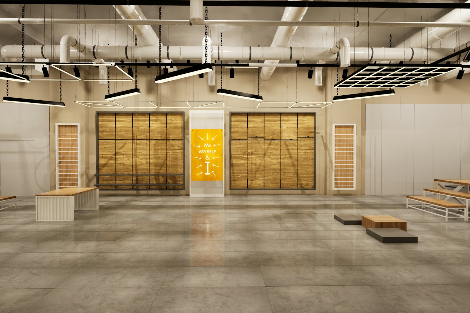
Twenty-five square metres is a parking bay, a foyer corner, a shopping-centre concourse pitch. It is also the most common activation footprint in the industry, and the one most often treated as a smaller version of something bigger.
It is not. A small footprint forces a single decision: what is the one thing a stranger does here? Everything that does not serve that is furniture.
Here are twelve formats that answer the question well.
1. The single-object display
One product, lit properly, on a plinth, with nothing else in the space. This works when the object is genuinely worth looking at and fails instantly when it is not. The whole design budget goes into lighting and the plinth.
Needs: good lighting, a security plan. Dwell time: 20–40 seconds.
2. The two-minute demo bench
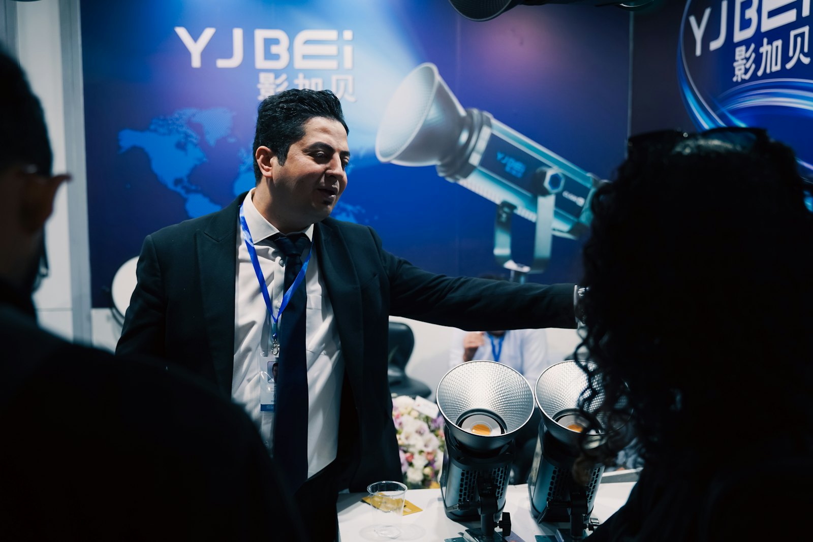
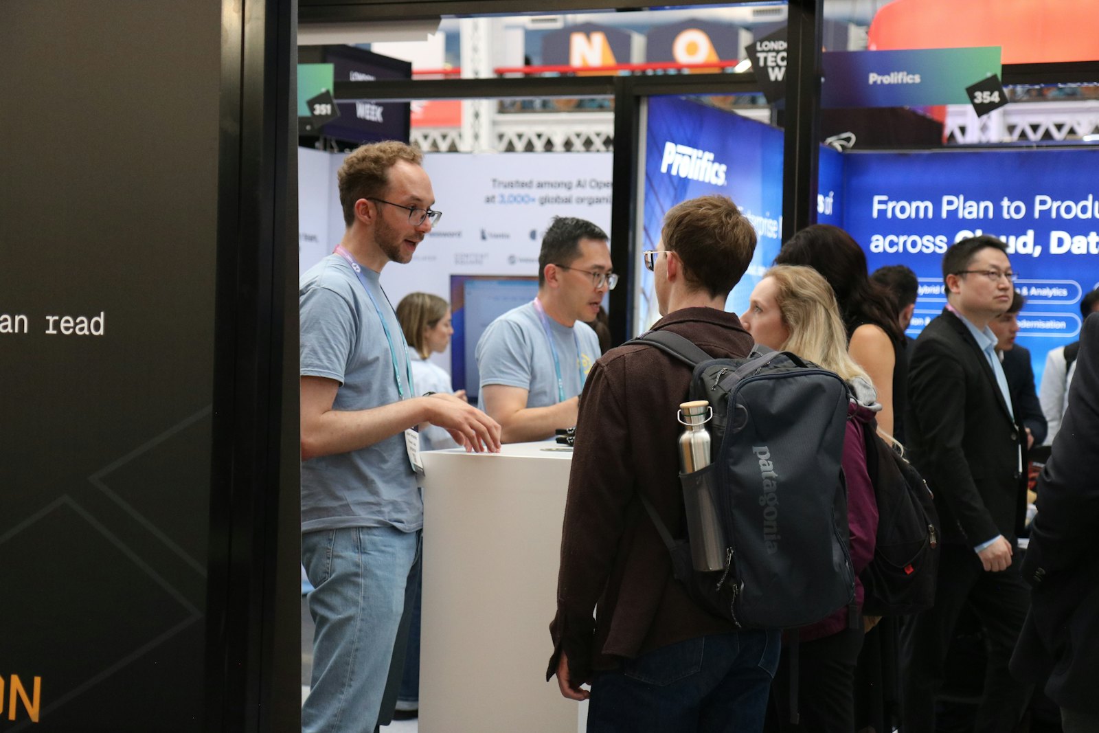
A counter, a staff member, and a product that does something visible. The format is old because it works. The discipline is the script: two minutes, three points, one question back.
Needs: power, a bench at working height, trained staff. Dwell: 2–4 minutes.
3. The comparison test
Your product and a reference side by side, with a way for the visitor to judge for themselves — a texture to touch, a sound to hear, a weight to lift. Credible because the visitor concludes, rather than being told.
4. The build-your-own counter
The visitor assembles, mixes or configures something and takes it away. High dwell, high cost per visitor, excellent photos.
Needs: consumables, two staff, a waste plan. Dwell: 4–8 minutes.
5. The single question wall
One question, visitors answer on cards or magnets, the wall fills over the day. Cheap, genuinely participatory, and it produces a usable artefact — the wall at the end of day three is the content.
6. The vertical set
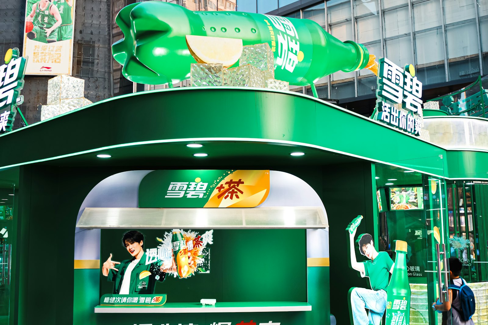
In a small footprint, the floor is scarce and the air is free. A three-metre vertical element — a hanging form, a stacked structure, a tall light — is seen from across the hall and occupies almost no floor.
7. The portrait station
A photographer, a considered backdrop, and a printed or emailed image. More credible than a selfie frame and it collects an email address honestly, in exchange for something people want.
8. The repair or service bar
Fix, clean, sharpen, calibrate or refill the thing the visitor already owns. Most powerful format on this list for brands with an installed base, and the one that generates the most useful conversations.
9. The waiting room
A genuinely comfortable place to sit, charge a phone and be quiet, lightly branded. At a long trade fair or a festival this is the most valued space in the hall, and your staff talk to people who are relaxed.
10. The sample flight
Three or five small samples in a fixed order, with a card explaining the sequence. Structured tasting beats a bowl of free samples because the visitor is doing something.
11. The archive table
Objects, drawings, prototypes and failures from your own history, laid out flat and allowed to be handled. Works extraordinarily well for engineering and manufacturing brands and costs almost nothing but curation.
12. The one-to-one booking desk
No spectacle at all: a desk, a calendar, and staff who book qualified meetings for later in the day or later in the month. Unfashionable, and frequently the highest-return use of a small footprint at a B2B event.
What the twelve have in common
Every format above gives the visitor something to do and gives your staff a reason to speak second. The idea is not the installation; the idea is the behaviour. Design the behaviour, then build the smallest thing that makes it possible.
That is also why the concept stage matters more at 25 m² than at 200 m². There is no room to hide a weak idea behind scale.
Related reading: measuring a brand activation covers what to count once it is running.